UCAR's Simple Climate Model
UCAR's
The Very, Very Simple Climate Model
(a flash based application)
displays a graph of expected future temperatures based on projected CO2 emissions.
It is highly interactive and allows you, the user, to define scenarios combining past, historical data
with future emissions of your choice
to see how the temperature will change (according to their model).
Before reading the rest of this page, I suggest that you access their model and
familiarize yourself with it.
In an effort to understand how the model works,
I used an swf (flash) decompiler to recover the internal model and the seed (historical) data.
Then I implemented an identical model in
this OpenOffice spreedsheet.
The purpose of this page is to present what I learned.
| Spoiler: |
| This analysis demonstrates that the supplied data disproves the association
between CO2 and temperature, assuming the default sensitivity of 3.0°C/doubling.
However, additional analysis using my
GHCN Temperature Plotter tool
indicates a pretty good correlation if the sensitivity is reduced
to 1.8°C/doubling.
|
UCAR's Model
| The Equation
- Reference issue
| Plots
| Notes
| GHCN Temperature Plotter
| Seed Data
| Conclusions
UCAR's Model
UCAR's flash model can be found via
UCAR interactives
and clicking
THE VERY, VERY SIMPLE CLIMATE MODEL.
I think it is pretty cool.
- You can use it to define future scenarios with various CO2 levels
- Under Settings, you can change the Climate Sensitivity
from 2.0°C to 5.0°C in 0.5°C steps
However
- Flash won't run on many Apple devices
- While the provided historical data starts in 1800, the model's starting year is 1960 - as a result, you can't see how bad the fit-to-theory is
- There is no way to plot actual (historical) temperature against values predicted using the supplied CO2 concentrations
The purpose of my analysis was to address the last 2 points.
By the way, the NSTA (National Science Teachers Association)
recomends this tools
to help teach students in grades 6 thru 8 about "climate science".
The Equation
The main equation used to associate a change in temperature to a change in CO2
concentration is the same as the one used by the IPCC and most
scientists supporting the CO2 causes Global Warming position.
ΔT = A * log([CO2]/[CO20])
|
where
- "A" is known as the "climate sensitivity".
- [CO2] is the current CO2 concentration
- [CO20] is the CO2 concentration at some reference point - my model uses 280 ppm in 1800 AD, theirs
uses 369.41 ppm and 14.4°C from about 2000 AD
In this equation, the base of the log is not important -
if a different base is selected the value of "A" is changed
and the results will still be the same.
For this UCAR model, log-base-2 is used.
For log-base-2, the value of "A" is the number of degrees-C the temperature changes for a
doubling of CO2.
Their default value is 3°C
In addition, the reference temperature and CO2 concentration are of little importance
because they don't change the shape of the curves and only produce an offset in the vertical direction.
UCAR provides additional details
on the associated activity page
- select the Background and Extensions tab,
scroll down to the Details of the Math Behind the Model section.
Reference issue
At this time, I am not able to find an IPCC equation relating a change in temperature to a change in CO2.
However, I did find
the following equation (from
IPCC FAR (1990), Chapter 2,
Radiative Forcing of Climate
page 52, Table 2.2)
that computes the forcing (in W/m2).
ΔF = 6.3 ln(C/C0) coefficient derived from Hansen et al (1988)
Values derived from Hansen et al have
been multiplied by 3.35 (Lacis, personal communication)
to convert forcing as a temperature change to forcing as a
change in net flux at the tropopause after allowing for
stratospheric temperature change
|
Then the change in temperature must be computed from the change in forcing.
Based on the IPCC comment, a simple division will suffice.
Perhaps - but this type of conversion normally depends on the base temperature to the fourth power,
some rearranging of terms, and a fourth root.
6.3/3.35 * log2(e) = 2.713°C/doubling
which is close to 3 - the default UCAR model climate sensitivity when using a log of base 2
|
When using
my tool,
the best fit is actually about 1.8°C/doubling - significantly below Hansen's (presumed) value of 2.713°C/doubling.
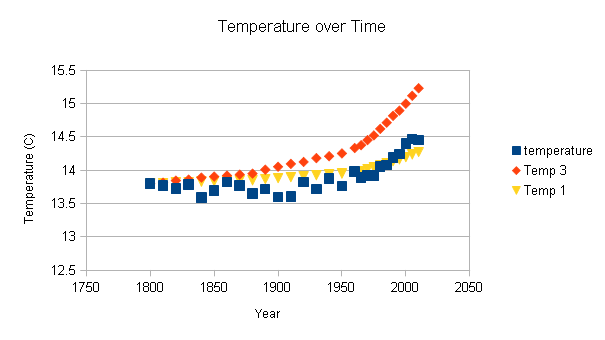
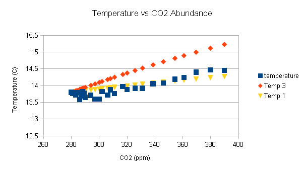
Plots
These are the charts from the spreadsheet.
| Blue
| This is the temperature provided in the UCAR seed data
|
| Orange
| This is the temperature computed using A=3°C - the model's default value
|
| Yellow
| This is the temperature computed using A=1°C
|
To be clear, the orange and yellow series are the expected temperatures
based on their CO2 data and their model.
Since their flash application does not provide a way to show the fit between
their model and historical data,
I produced these plots for that purpose.
Since this is a spreadsheet, and because
I am providing you a copy,
you can change the climate sensitivity (A) to any value you want.
If the model was correct, then the computed temperature (the orange diamonds)
should overlap the historical temperatures (the blue squares)
in both plots.
The fact that they aren't even close demonstrates, without a doubt,
that CO2 does not affect the temperature in the way the model claims.
The fact that I used a different calibration point than the UCAR model (see next section) really has no effect.
The shape of the computed temperature curve should still be the same - but with an offset in the
vertical direction.
The Temperature vs CO2 plot could be interpreted to show that above 370 ppm, increased CO2 either has no effect,
or might actually cause the temperature to decrease.
However, I want another 20 years of data before claiming something that radical ... but it is what their
data shows.
And this is the real problem - since the UCAR model starts in 1960,
it shows a close correlation between the theory and the actual data.
The complete lack of agreement is only visible when all the data is used!
In my opinion, this would be cherry picking of the worst kind ...
except that they did not bother to even show that much data on their plots.
To be clear - their model tacks projected data on to historical data without
showing any overlap between the historical and projected temperatures.
(By overlap I mean showing both the historical and modeled data
for the same time period on the same plot.)
The graphs above show the overlap .. and lack of agreement.
(To be fair, if I had not found such a blatant discrepancy I probably would not have produced this page.
I was analyzing the model so that I could use the base formula in another program.
The plots were made just to test the accuracy of the model.
I expected poor agreement - but nothing this dramatic.)
Notes
These are just a few notes about the model.
This is the key model statement
this._temperature = this._baselineTemperature + this._climateSensitivity * Math.LOG2E * Math.log(this._co2Concentration / this._baselineCO2Concentration);
|
located in
public class World extends Object
|
Other useful statements.
 this._climateSensitivity = 3; // 3°C per doubling CO2

  public function set climateSensitivity(param1:Number) : void
  {
     this._climateSensitivity = param1;
  }

 private var _baselineTemperature:Number = 14.4008;
 private var _baselineCO2Concentration:Number = 369.41;
|
- _climateSensitivity can be changed via the Settings dialog - 2.0°C to 5.0°C in 0.5°C steps
- The default temperature and CO2 concentration appear to be near 2000 AD, but don't match any values in the table
- _baselineCO2Concentration and _baselineTemperature can be reset depending on the baseline year,
but the current application does not allow the user to change those values.
GHCN Temperature Plotter
I was not very happy with the spreadsheet plots
- Too difficult to modify the parameters - sensitivity and base year
- Not able to compare data with other sources (such as GHCN)
- Users need to download the data and open it in a spreadsheet to modify the parameters
As a result, I modified my
GHCN Temperature Plotter tool
to simplify parameter modification
and provided
full instructions
on how to use the new CO2 tab.
I found that the best fit uses a base year of 1975
(the UCAR model uses 2000, the spreadsheet uses 1800)
and the doubling
is actually about 1.8°C - significantly below Hansen's (presumed) value of 2.713°C/doubling
and the UCAR model's default of 3°C/doubling.
In the UCAR model, the base year is not important since they do not show both
the model results and the historical data for each year -
they just tack the model results on to the end of the historical data.
As a result, there is no way for anyone to make a judgment on the validity of their model.
In my opinion, .. well, I don't think much of their model.
Seed Data
This is the data used to seed the UCAR model.
It is the same data used in the spreadsheet to produce the graphs
and in my
GHCN Temperature Plotter tool.
I have not attempted to verify this data but have simply accepted it as presented.
|
<historicalData>
<dataPoint year="1800" co2Emissions="0.007" co2Concentration="280" temperature="13.798"/>
<dataPoint year="1810" co2Emissions="10" co2Concentration="281" temperature="13.766"/>
<dataPoint year="1820" co2Emissions="0.014" co2Concentration="283" temperature="13.722"/>
<dataPoint year="1830" co2Emissions="10" co2Concentration="284" temperature="13.786"/>
<dataPoint year="1840" co2Emissions="0.031" co2Concentration="286" temperature="13.590"/>
<dataPoint year="1850" co2Emissions="0.551" co2Concentration="287" temperature="13.695"/>
<dataPoint year="1860" co2Emissions="0.652" co2Concentration="288" temperature="13.822"/>
<dataPoint year="1870" co2Emissions="0.658" co2Concentration="289" temperature="13.771"/>
<dataPoint year="1880" co2Emissions="0.893" co2Concentration="290" temperature="13.649"/>
<dataPoint year="1890" co2Emissions="1.013" co2Concentration="294" temperature="13.713"/>
<dataPoint year="1900" co2Emissions="1.234" co2Concentration="297" temperature="13.595"/>
<dataPoint year="1910" co2Emissions="1.726" co2Concentration="300" temperature="13.601"/>
<dataPoint year="1920" co2Emissions="1.615" co2Concentration="302" temperature="13.821"/>
<dataPoint year="1930" co2Emissions="2.163" co2Concentration="306" temperature="13.717"/>
<dataPoint year="1940" co2Emissions="2.080" co2Concentration="308" temperature="13.875"/>
<dataPoint year="1950" co2Emissions="2.456" co2Concentration="311" temperature="13.761"/>
<dataPoint year="1960" co2Emissions="4.14" co2Concentration="316.91" temperature="13.977"/>
<dataPoint year="1965" co2Emissions="4.68" co2Concentration="320.04" temperature="13.886"/>
<dataPoint year="1970" co2Emissions="5.59" co2Concentration="325.68" temperature="13.922"/>
<dataPoint year="1975" co2Emissions="5.86" co2Concentration="331.08" temperature="13.920"/>
<dataPoint year="1980" co2Emissions="6.53" co2Concentration="338.68" temperature="14.053"/>
<dataPoint year="1985" co2Emissions="6.68" co2Concentration="346.04" temperature="14.081"/>
<dataPoint year="1990" co2Emissions="7.34" co2Concentration="354.35" temperature="14.191"/>
<dataPoint year="1995" co2Emissions="7.79" co2Concentration="360.80" temperature="14.239"/>
<dataPoint year="2000" co2Emissions="7.79" co2Concentration="369.52" temperature="14.401"/>
<dataPoint year="2005" co2Emissions="8.93" co2Concentration="379.80" temperature="14.471"/>
<dataPoint year="2010" co2Emissions="9.84" co2Concentration="389.85" temperature="14.451"/>
</historicalData>
|
| co2Emissions
| Gt - "10" probably means "unknown"
|
|---|
| co2Concentration
| ppm (parts per million)
|
|---|
| temperature
| °C
|
|---|
Yet,
none of the values in the provided table are that high.
In fact, the UCAR data sets the temperature in the 1920's to be about 13.7°C!
Conclusions
It should be obvious from the plots that increasing CO2 has no effect on the temperature.
The other interpretation is that the supplied historical data is wrong - very wrong.
Either way, after a failure of this magnitude, all UCAR interactive models must be considered suspect. Use caution.
Author:
Robert Clemenzi